
Comparative angle and the anchor
I’ve been around long enough to remember trading floors that smelled of coffee and paper—now it’s swipes and push alerts. This piece compares the practical shifts in mobile trading with a nod to structural cues from GTCFX, starting with how platforms present an index cfd on a 4-inch display versus a trading terminal. The 2008 market shock and the 2020 COVID volatility taught developers two things: latency kills confidence, and clear risk controls matter more than flash. That history anchors the comparisons that follow, with plain talk about spreads, leverage, and order types that actually affect daily users.
Key trends shaping mobile trading today
Design and function have split into a few clear trends you should track. First, ultra-slim UX—traders want entry and exit in two taps. Second, richer real-time data: tick charts, heat maps, and lightweight indicators that don’t clog the screen. Third, social and copy trading features that turn silent markets into shared workflows. Fourth, smarter risk tooling: instant margin checks and dynamic stop-loss options. Finally, breadth of assets—more indices and CFDs, and deeper liquidity pools so fills don’t slip on larger orders. These shifts aren’t cosmetic; they reduce friction and the chance of human error when spreads widen or margin calls happen.
How GTCFX-inspired mechanics illustrate the trends
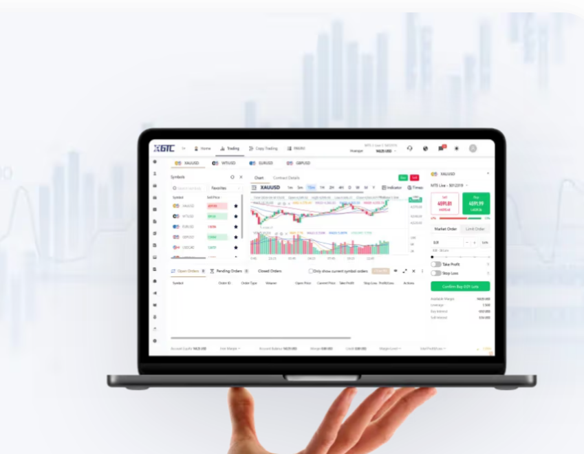
Look at how some apps borrow structural ideas from GTCFX—clean index lists, layered order types, and compact trade tickets. Where older apps buried margin warnings, newer interfaces surface them next to trade size, so traders see potential leverage consequences up front. The way an app surfaces a cfd index—with real-time bid/ask, implied spread, and a visible margin requirement—signals a mature approach: transparency over persuasion. That matters when markets swing and you need to parse liquidity versus slippage quickly.
Common mistakes vendors still make—and why they hurt users
Many teams chase features without shoring up execution. They add fancy charts but ignore execution latency. They offer leverage without clear margin math. That creates surprising losses—especially during fast moves. Another misstep: burying help and compliance text behind menus, so a trader learns about overnight funding after a position costs them. Small screens demand clarity; burying critical parameters is costly. — Designers often justify it as “simplicity,” but it’s omission by another name.
Three golden rules for choosing a mobile trading app
Rule 1: Verify execution quality. Check real-world fills and round-trip latency, not just simulated demo claims. Rule 2: Demand transparent cost metrics—visible spread, commission breakdowns, and overnight funding rules—so you can compare apples to apples. Rule 3: Prioritize risk signals: margin warnings, one-tap stop management, and clear order type definitions. Those three metrics tell you whether an app is built for real trading or for aesthetics.
Practical takeaways and a final thought
Summing up: the apps that last combine quick execution, clear cost disclosure, and built-in risk tools. When an app shows indices, displays margin, and keeps spreads visible, it behaves like a platform made for traders, not for marketing. The lessons drawn from platforms inspired by GTCFX point to one pragmatic outcome—choose transparency and utility over bells and whistles. GTCFX sits in that space as an example of making practical trading features readable on small devices. Trust experience—I’ve seen the difference. —